Global Search on Dwolla.com
The Problem
Dwolla users reported trouble navigating and finding relevant information on the site, which contains extensive content such as case studies, developer resources, and blog posts. The marketing team relies on these sources to generate marketing accepted leads (MALs), but users were struggling to locate them.
My Process
- Gather Requirements
- Competitive Analysis & Research
- Wireframes
- Review with Stakeholders
- Mockups & Prototyping
- Iterate on Feedback
- Finalize Designs & Prepare for Development
Challenge
The key challenge in designing a global search experience is managing diverse content while ensuring the system remains fast, consistent, and scalable. Balancing these elements is crucial to developing an effective and user-friendly search feature that efficiently handles a wide range of content.
Animation
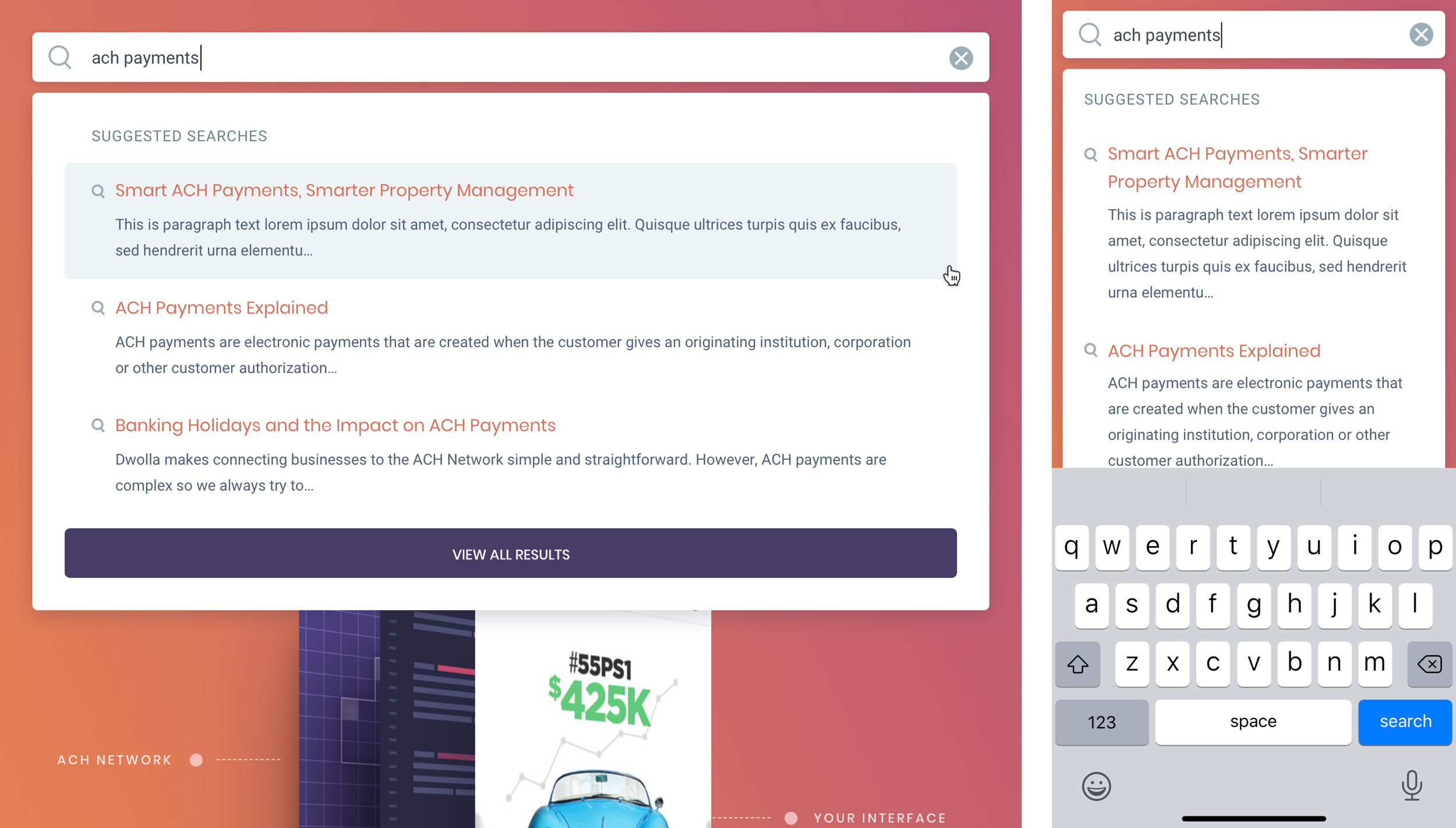
I designed an animation in AfterEffects to demonstrate how the search input would overlay the navigation, maximizing screen space and adding a subtle, delightful touch to the user experience.
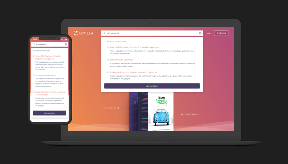
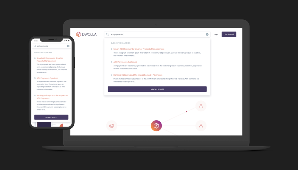
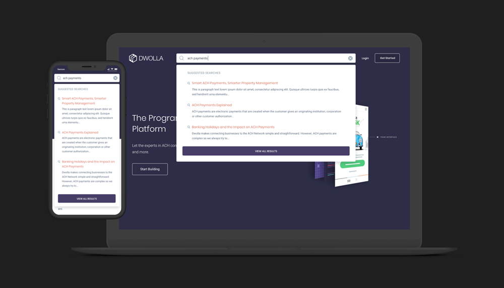
Auto-suggestion
As users type, suggested content appears to guide them in refining their search query. A third-party search engine API would be integrated to power this feature, streamlining development and saving time. By default, the top three results are displayed.
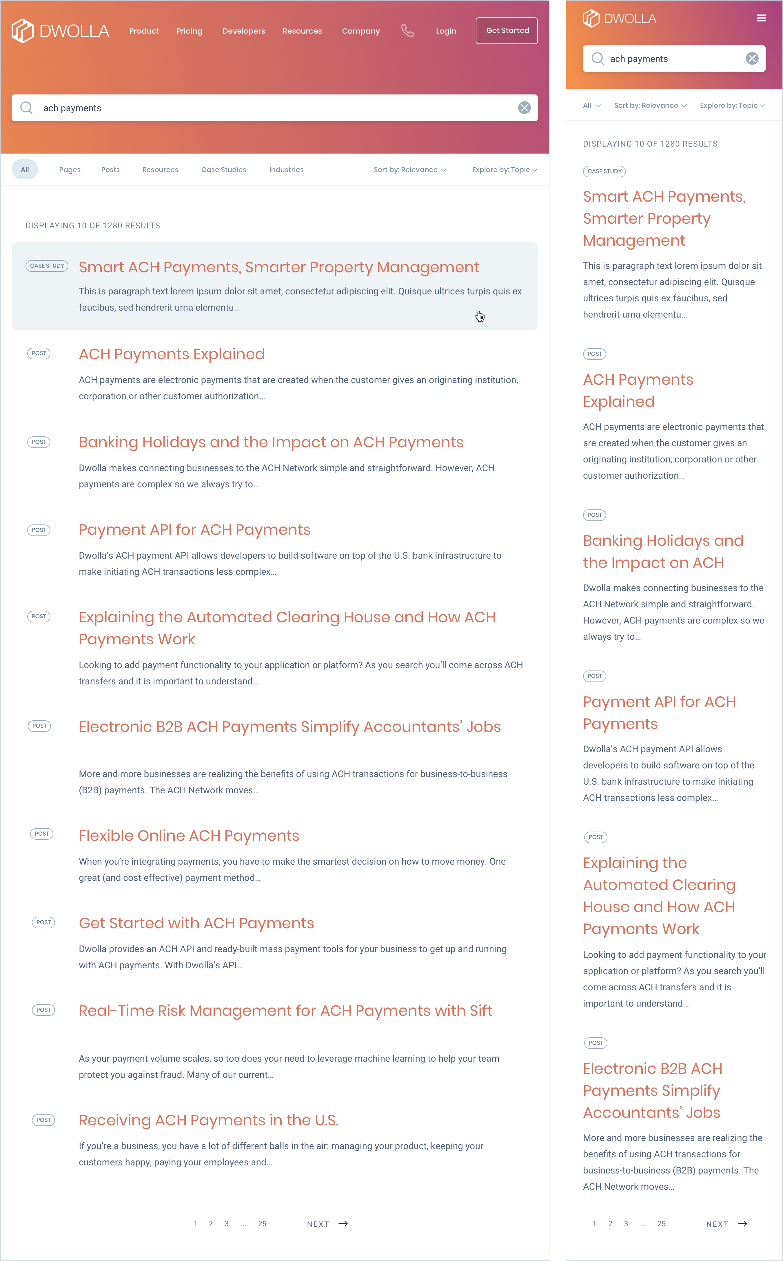
Search Results Page
The total number of matching results is displayed at the top of the page, allowing users to gauge how much time they want to spend reviewing the results. Each page shows ten results by default, with pagination available at the bottom for easy navigation.
Filtering and sorting options help users narrow down the search results and make them relevant to their intention. Badges next to each result indicate the category it belongs to, enabling quick scanning and cognitive recognition.
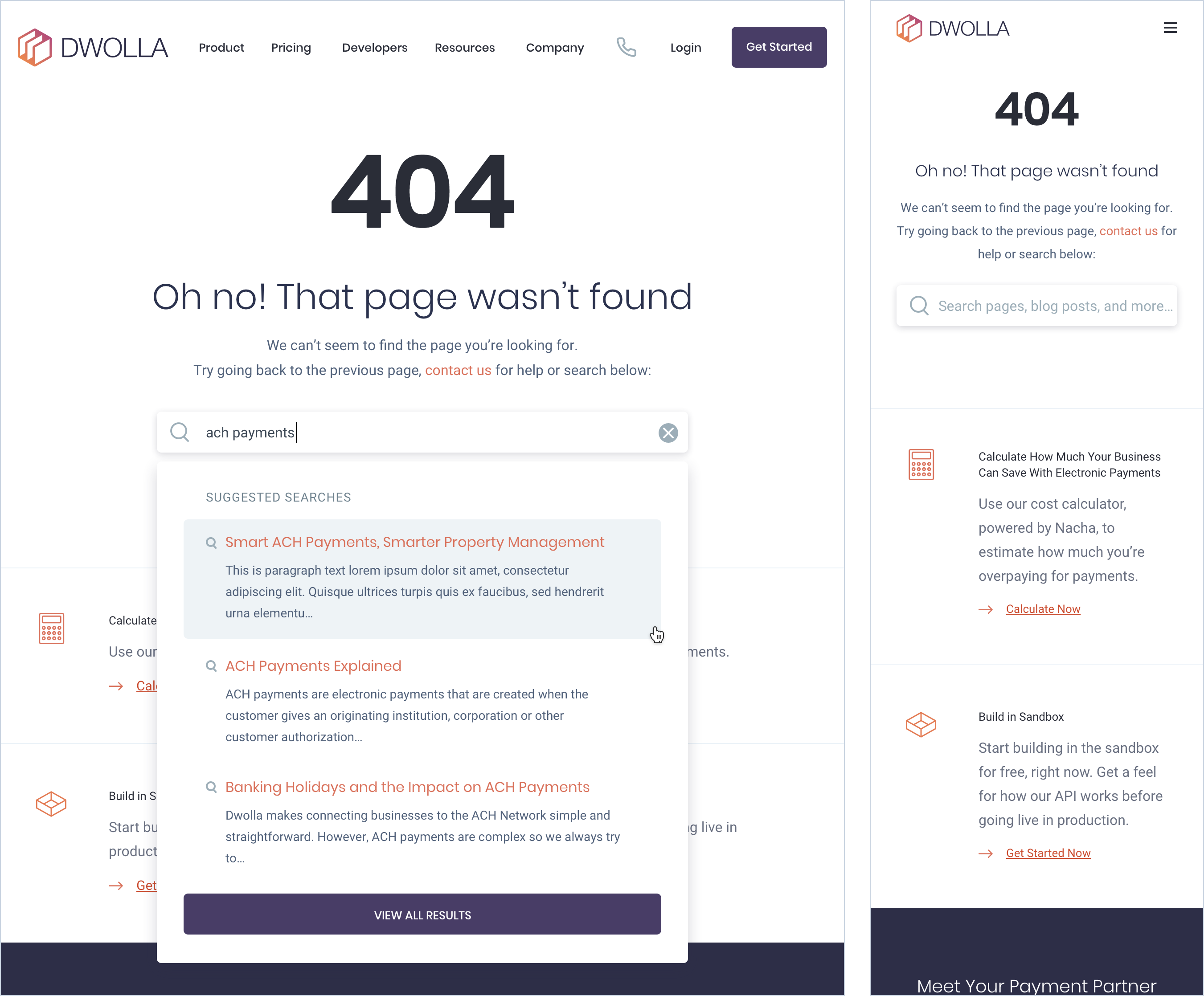
'No Results' Page - Turn Dead Ends Into Opportunities
Dropping someone on a page with no results can be frustrating. Especially if they already have tried the search a few times. Avoid showing users dead-end search results pages (when the search produces no matching results). To address this, we provide clear and helpful options to move forward, including links for chat, email, and phone support. This allows users to quickly get assistance or explore alternative solutions, minimizing frustration and enhancing overall satisfaction.
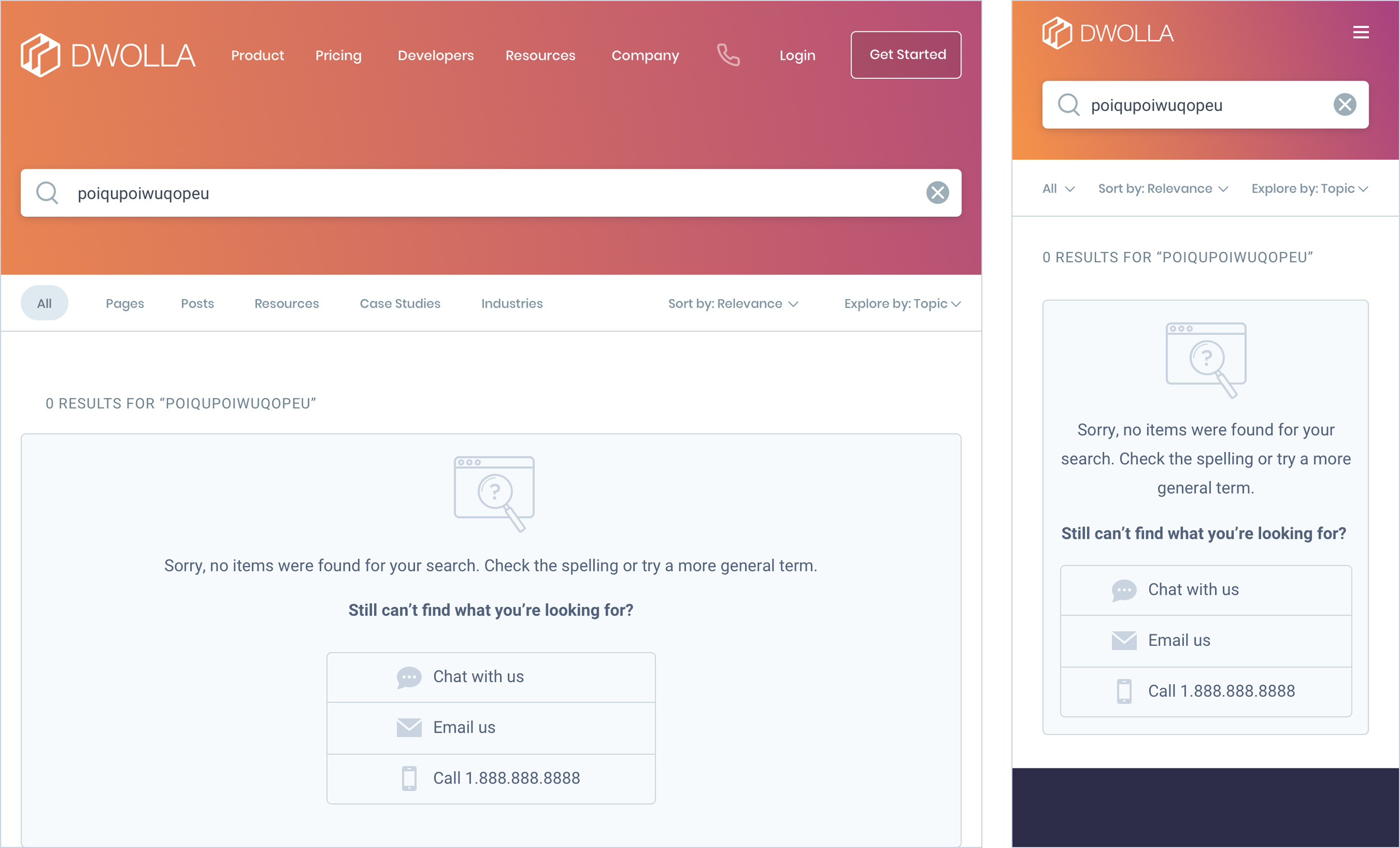
Add Search Field to 404 Pages
To address the issue of users getting stuck on dead-end pages, a search field was added to every page, including 404 errors. This ensures that users have a clear way to find the content they need, regardless of where they land.
Final Results
User feedback indicated that the improvements made accessing and discovering content much easier and more intuitive, reduced the time spent searching for relevant items, and minimized frustration.
Interactive Prototypes
Follow the on-screen hot spots that appear when you click/tap on the screen.
Other Projects
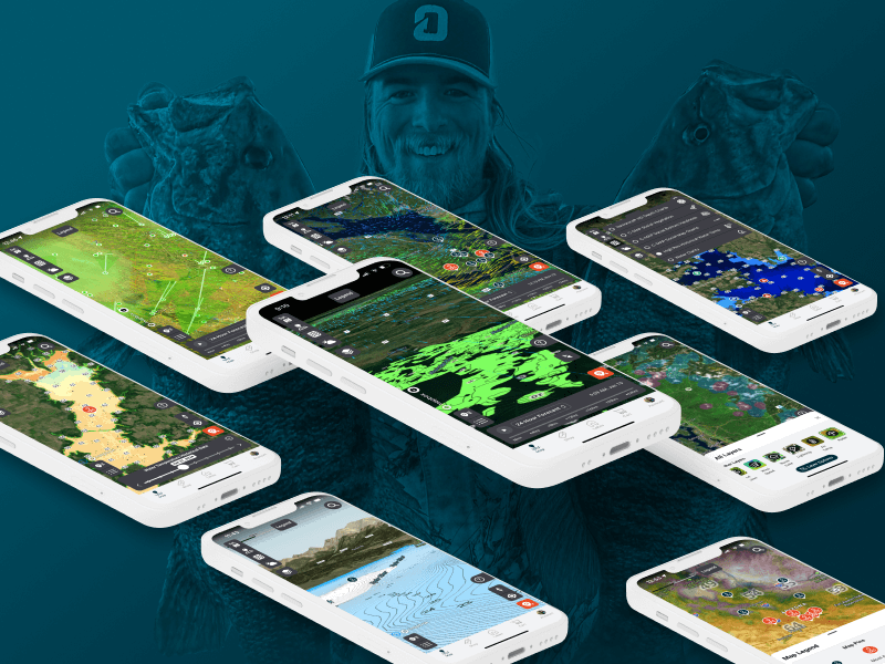
Omnia PRO Advanced Mapping ToolsUX / UI Design
Dwolla Developer Portal RedesignUX / UI Design
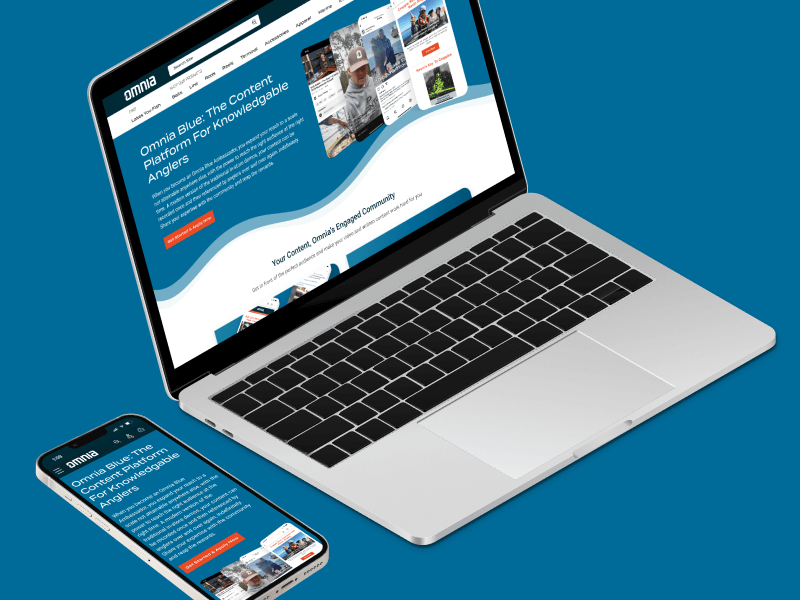
Omnia Blue Landing PageWeb Design
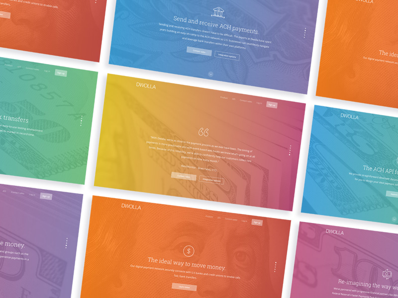
Dwolla Marketing Site RedesignWeb Design
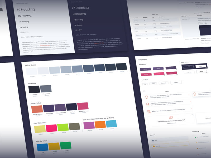
Dwolla Identity Design SystemBranding
Montoya Lawn & Outdoor ServicesBranding
FinTech Product PrototypeUX / UI Design

Dwolla Core ValuesBranding

Landing Page GraphicIllustration
Red Benny Font SpecimenBranding / Typography

Office City Location IllustrationsIllustration

Louis C.K.Illustration
Flat Finance IconsIllustration
Democrat Republican LogoIllustration

Isometric IllustrationsIllustration
Flat Audience IconsIllustration
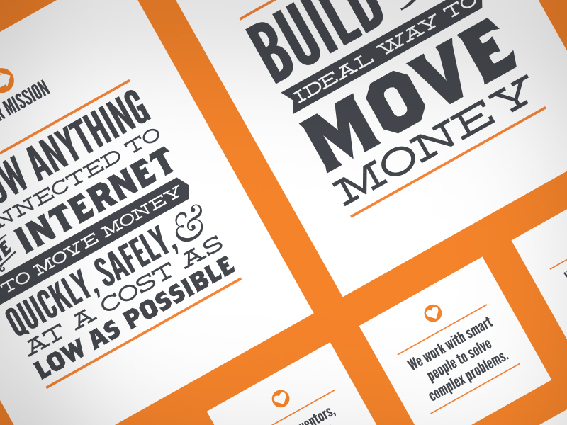
Dwolla Mission, Visions & ValuesTypography / Print
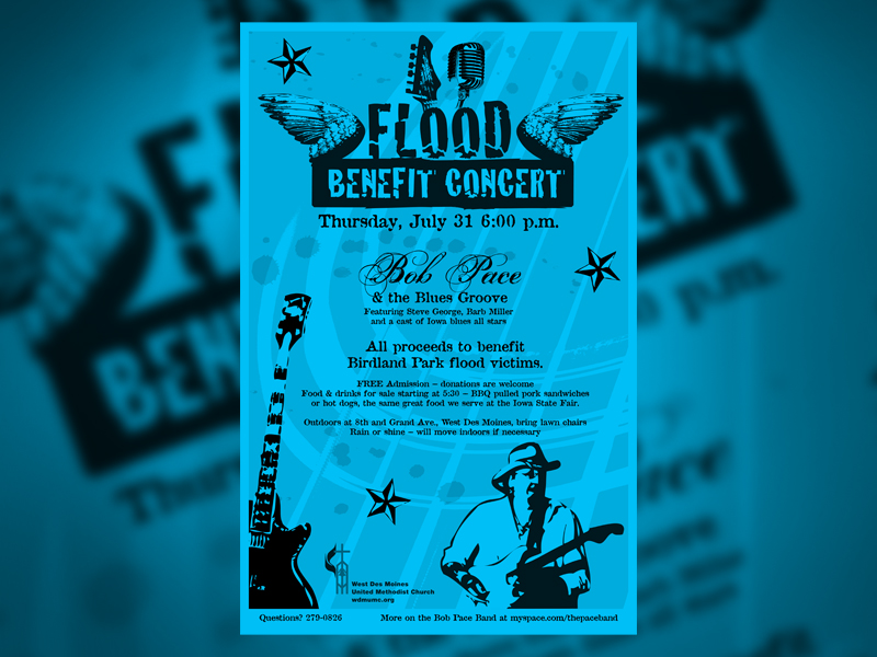
Food Benefit PosterPrint