Dwolla Developer Portal Redesign
The Problem
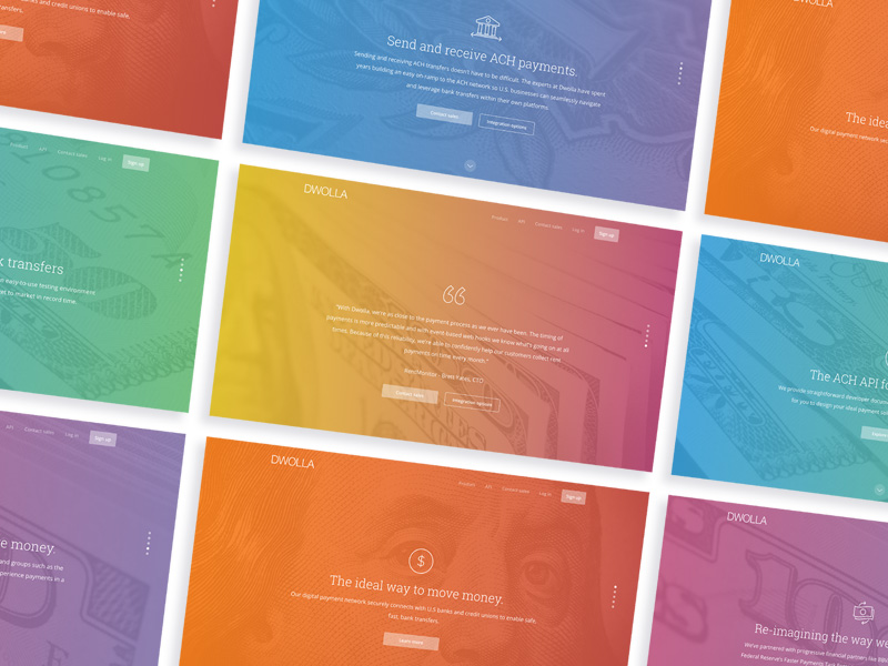
The Dwolla developer portal is a set of guides, articles and resources that allows businesses and developers to leverage the ACH API to build software on top of the U.S. banking system and move money.
Nearly five years had passed since the last portal relaunch, and during this time, the content had significantly changed. As new guides and articles were added, the content structure became disorganized and challenging to navigate. Additional navigation elements were introduced without a clear strategy, resulting in a less focused experience and making it harder for developers to find what they needed. A redesign was necessary.
I led the UX process and collaborated closely with four members of the Developer Relations team over approximately three months.
User Research
The Developer Relations team engages with developers on the Dwolla platform daily, addressing questions and collecting feedback, providing ample information about their needs.
Early in the process, a user research plan was put in place. Both in-person and remote interviews were conducted to gain valuable insights into the developers' requirements.
Competitive Analysis
Our next research phase involved examining leading developer portals such as Twilio, Pebble, and Github. We reviewed industry standards and identified common design patterns that could be adapted for our needs.
After completing this research and discovery phase, we convened as a team to outline our goals for the redesign.
The Goals
- Clearly communicate functionality and benefits
- Reduce inbound support
- Ensure the developer portal is a core part of the Dwolla experience
- Improve navigation and findability
- Provide a clean, concise, elegant reading experience
- Colors should be used in a more purposeful and meaningful way to indicate actions and alerts
- Bring it in-line with brand standards
- Reduce the “busy work” required by developers to accomplish tasks
Content Strategy - Card Sorting
I conducted a card sorting exercise with the Developer Relations team to categorize content into meaningful groups and label them appropriately. The insights gained from this exercise informed the design of menus, navigation, and the overall content layout, ensuring that information was organized in a way that improved usability and made it easier for users to access relevant content.
Additionally, we audited the existing content and restructured it more effectively. Some guides and articles were rewritten, and new content was created to better direct developers to the information they needed.
Wireframes, Mockups & Prototypes
I worked closely with the Developer Relations team through weekly workshops, where we used whiteboarding and brainstorming sessions to explore ideas. We created numerous wireframes and mockups, iterating and refining them over time. Daily standups were held to address potential roadblocks, ensure effective collaboration, and maintain alignment throughout the project.
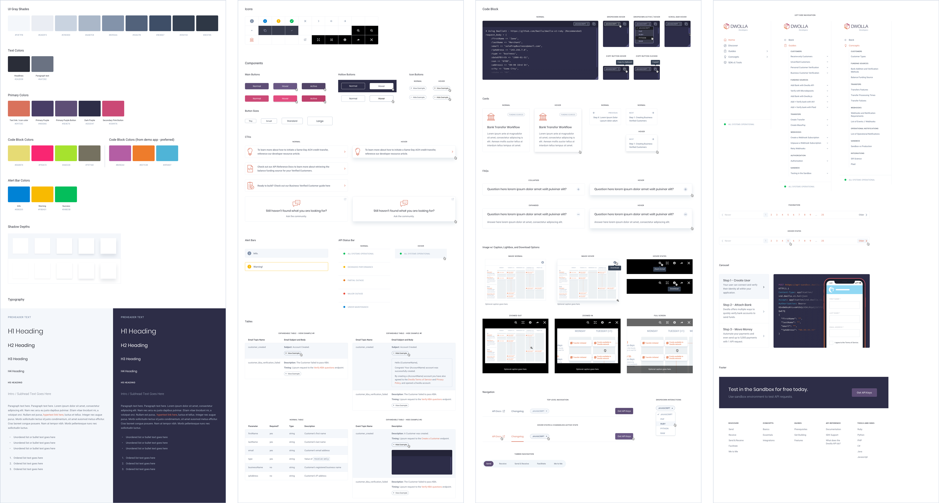
Design System
Implementing a design system ensured consistency, efficiency, and scalability by offering standardized components and guidelines. It improved team collaboration, upheld high-quality standards, and enhanced the user experience with uniform design patterns and predictable interactions. We used Storybook to manage the component library.
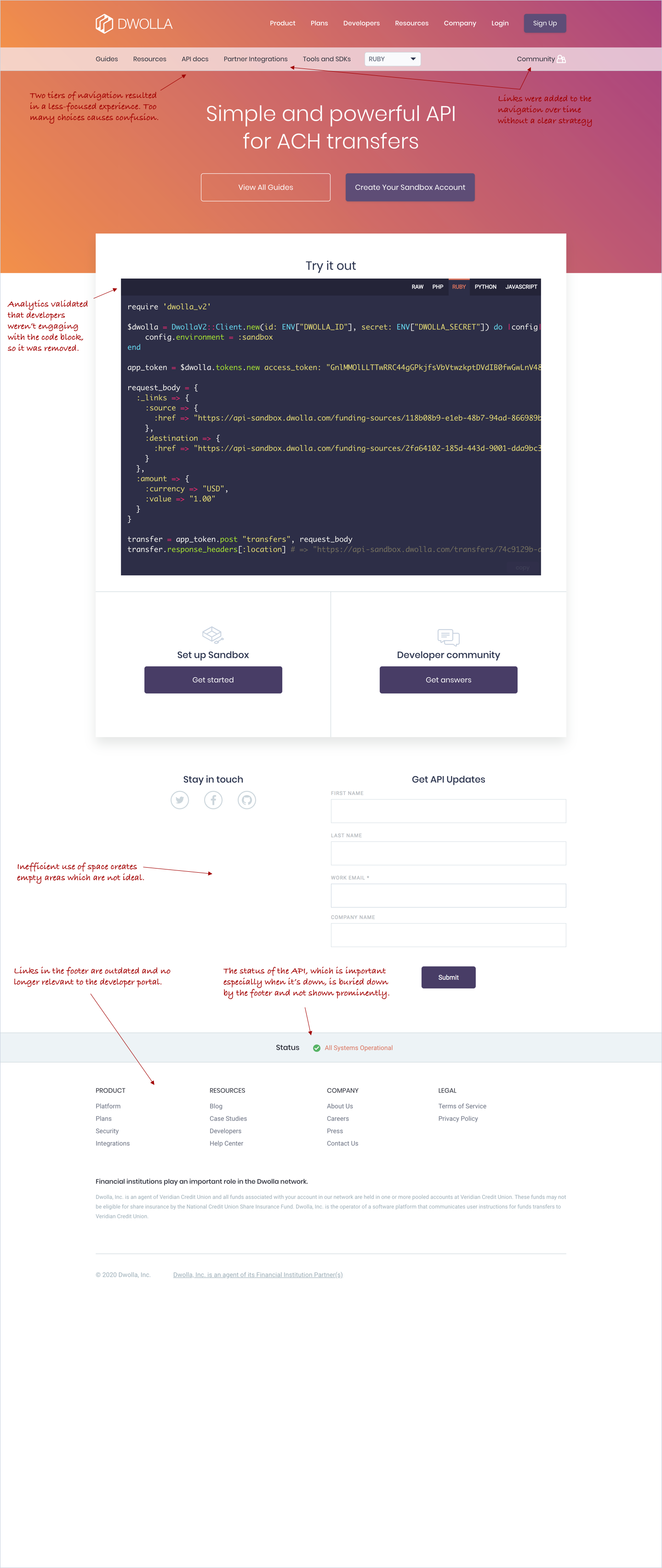
The Home Page
The home page underwent significant improvements, providing a much clearer overview of the entire site and effectively serving as an index for all content. It now offers enhanced visibility for resources such as the developer community forum, API reference documentation, and SDKs.
Before Redesign
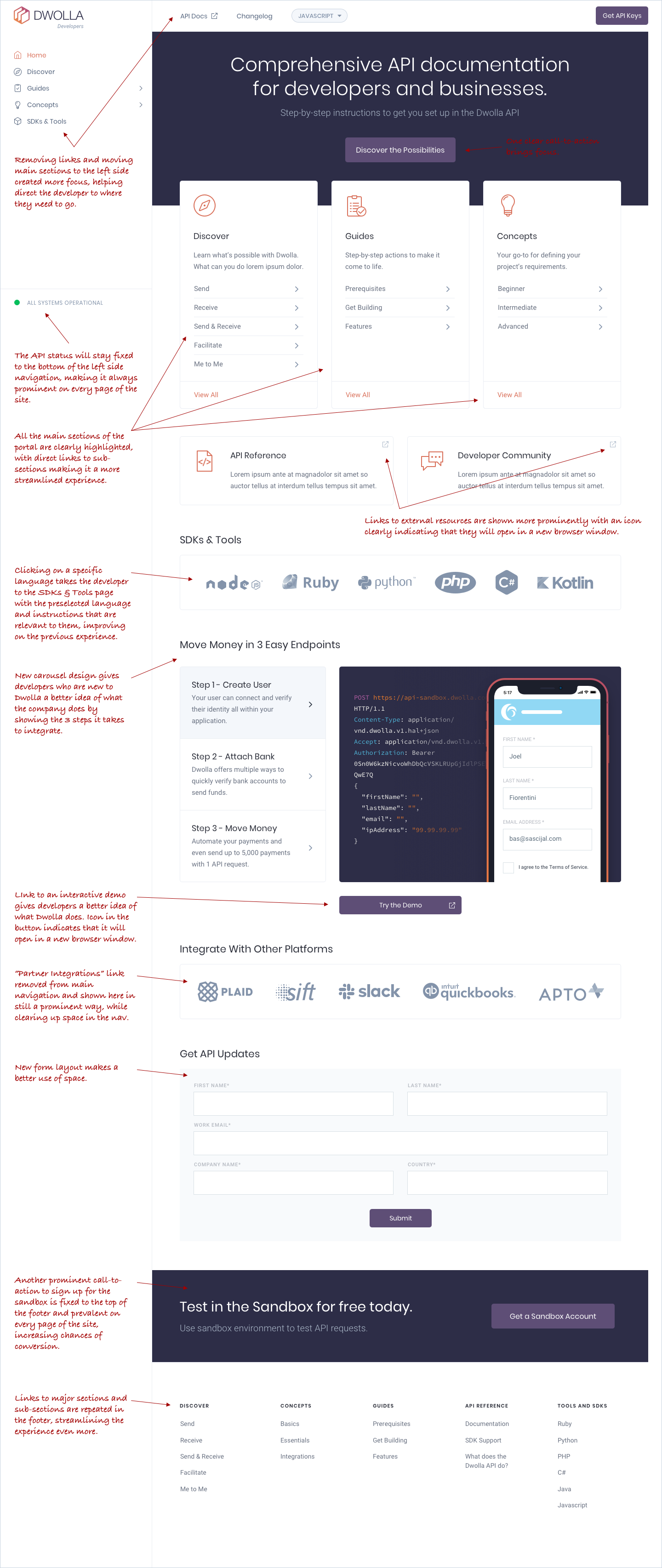
Side Navigation
Side navigation presented several UX challenges:
- Space Constraints: It can take up valuable screen space, especially on smaller devices.
- Complexity: Overloaded menus can overwhelm users and obscure information.
- Visibility: Navigation might not always be visible or accessible, particularly on mobile.
- Responsiveness: Adapting it for different screen sizes can hide important links.
- User Context: Users may find side navigation less intuitive if they’re used to different patterns.
- Consistency: Inconsistent navigation can disrupt user flow.
Addressing these challenges required thoughtful design, including clear categorization and responsive layouts to ensure that side navigation enhanced rather than hindered the overall user experience.
Guides & Concepts Index Pages
With the new content strategy, the 'Guides' and 'Concepts' sections were organized into distinct categories. Tabbed navigation enables developers to filter content according to their experience and skill level.
Guides & Articles
Following customer feedback, several UX enhancements were implemented on guide and article pages to streamline the experience for developers.
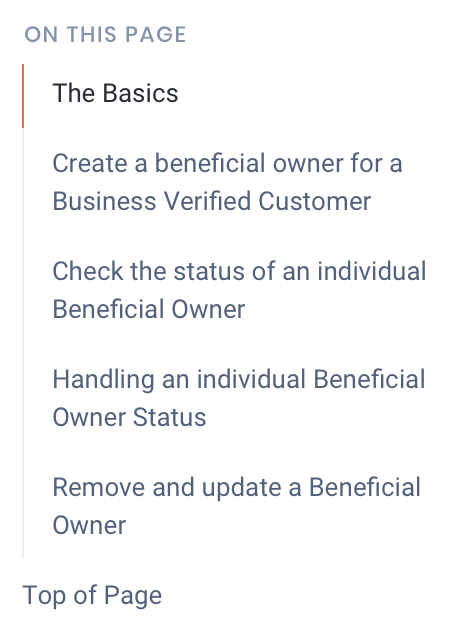
Right Side Navigation
A summary of the page content is displayed in the right-side navigation, enabling users to jump to specific sections. Additionally, a quick link at the bottom of the page allows users to easily return to the top.
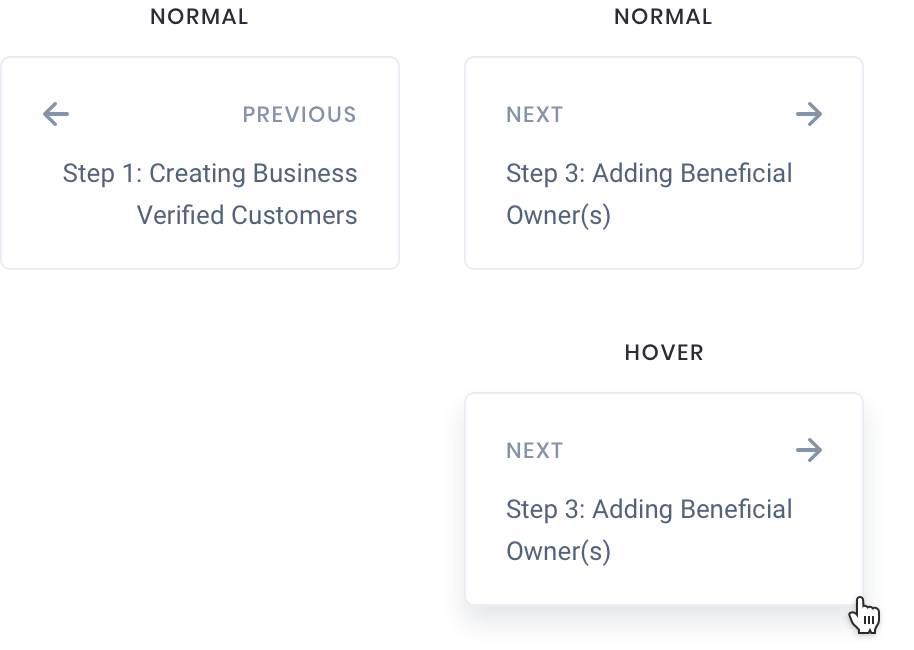
Previous/Next Step Navigation
Navigation controls were added to the bottom of each guide, allowing users to seamlessly move between steps by jumping to the previous or next section. This placement ensures users can easily follow along with the guide without having to scroll back to the top, enhancing the overall usability and flow of the content.
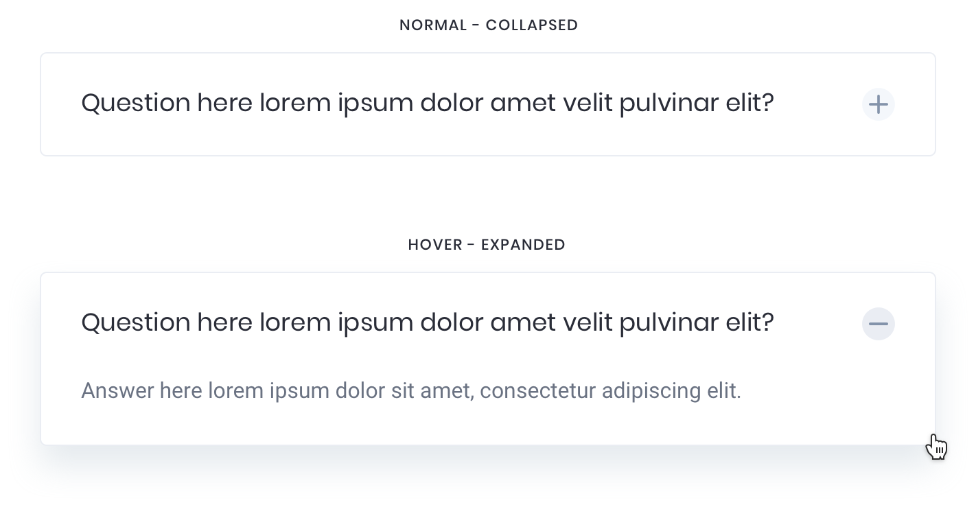
Collapsable/Expandable FAQs
The updated FAQ components now feature expandable functionality, making it easier for developers to access and view relevant FAQs. Non-relevant questions are collapsed, allowing users to quickly scan and find the information they need.
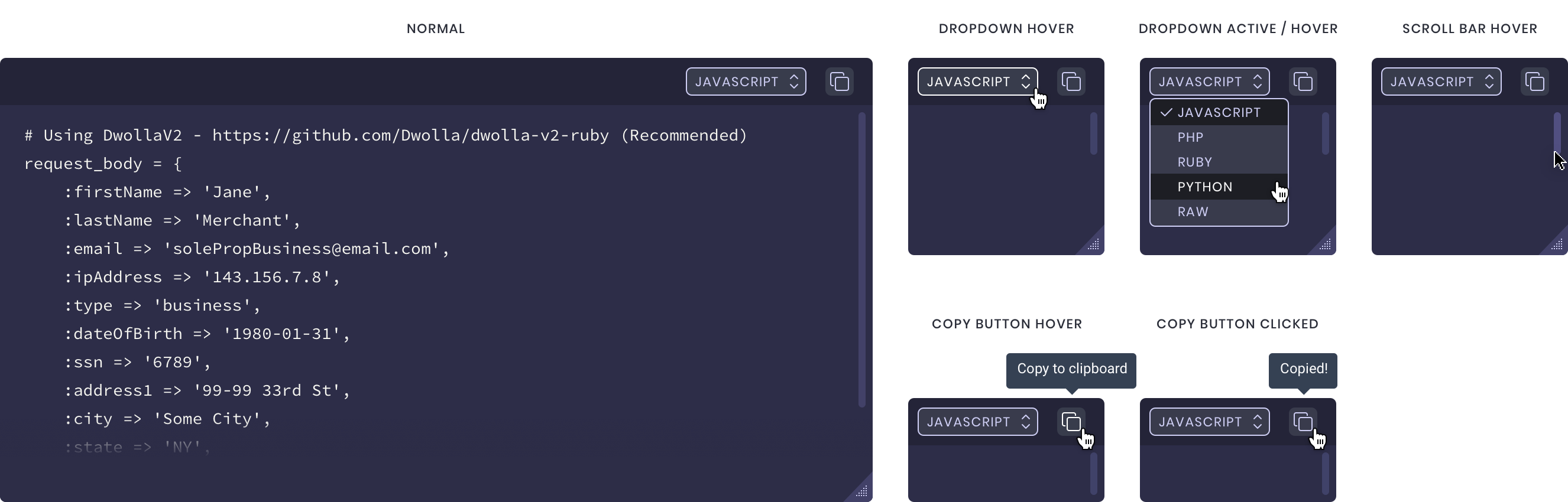
Code Blocks
User feedback indicated that the existing code blocks were frequently too long, leading to excessive scrolling. To address this, we added the ability to expand code blocks by dragging the bottom right corner, reducing the need for extensive page scrolling.
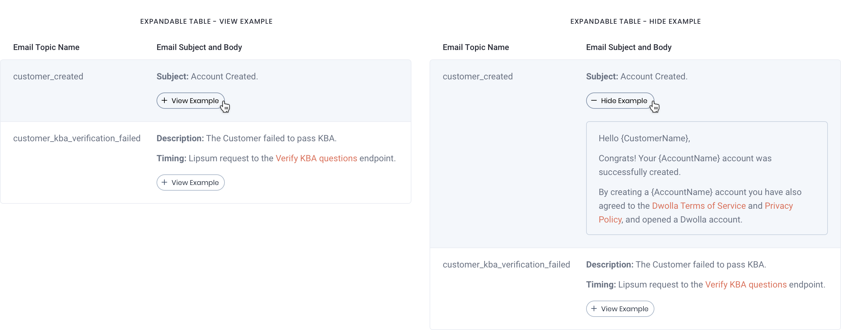
Tables
New functionality allows users to expand and collapse sections of tables, revealing content and additional code examples, which helps to reduce page scrolling.
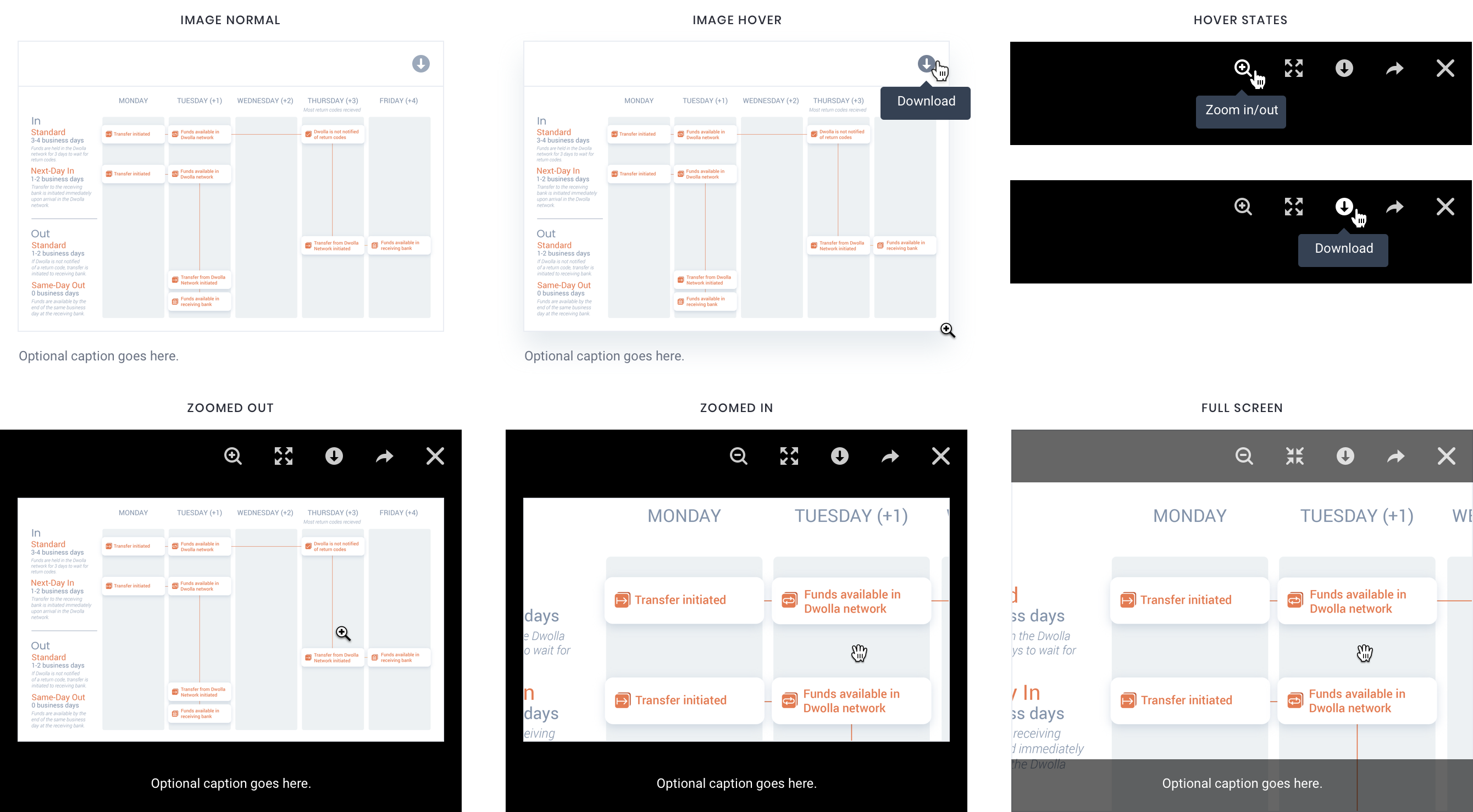
Updated Image Options: Download & Lightbox View
We added the ability to download embedded images and introduced various viewing options to enhance the image display throughout the portal.
Calls-to-Action
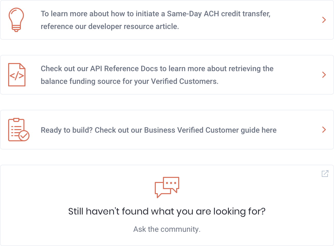
New CTAs were strategically positioned within guides and articles, linking to related resources. Each CTA includes an icon to indicate its destination, aiding cognitive recognition for future visits. They are designed to be subtly noticeable without disrupting the reading experience.
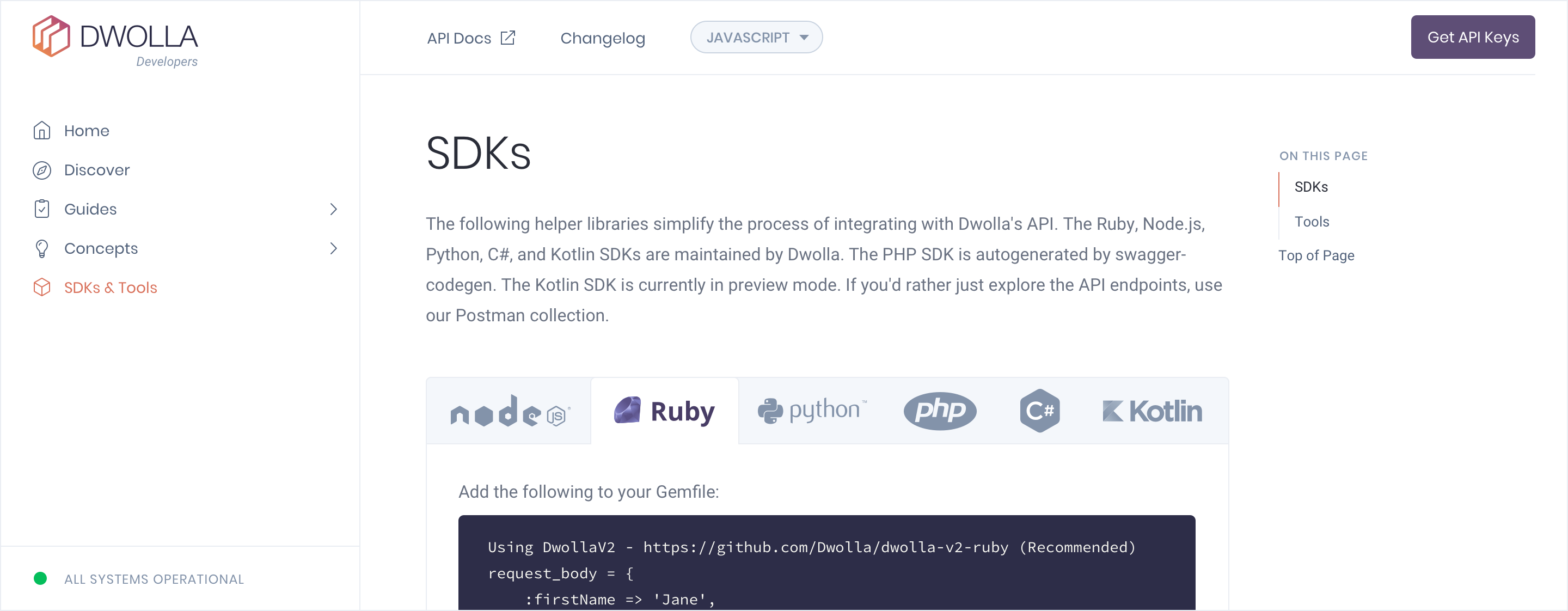
SDKs & Tools
The SDKs page was updated to default to the preselected programming language, providing relevant instructions for getting started. Additionally, right-side navigation now highlights the availability of extra tools and resources on the page, enhancing their visibility.
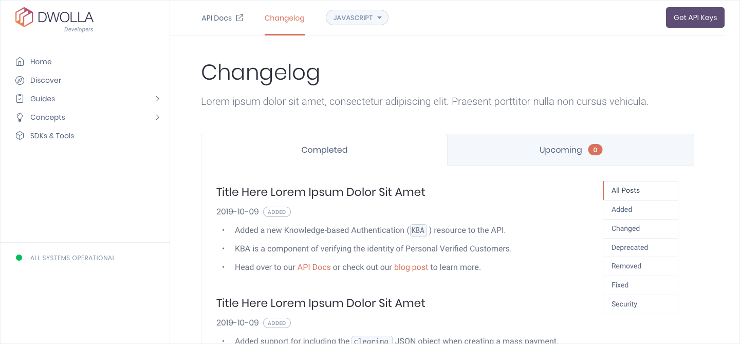
Changelog
A new Changelog was implemented to provide a clear and organized record of updates, changes, and improvements made to the portal. It helps users, developers, and stakeholders understand what has been added, modified, or fixed in each version or release. By documenting these changes, a changelog facilitates better communication, transparency, and tracking of progress, allowing users to stay informed about new features, enhancements, and bug fixes.
Final Results
By identifying developer needs, I played a key role in revamping the Dwolla Developer Portal, implementing a new information architecture to ensure seamless navigation. The redesigned portal was launched in Q1/Q2 2020. We achieved the following:
- Higher Conversion Rate: We identified key personas, along with their needs, expectations, and pain points, and categorized them into beginner, intermediate, and advanced groups. This segmentation allowed us to guide users along a desired journey, ultimately leading to increased conversions.
- Improved User Journey Tracking: The new design enabled Dwolla to track users' journeys, including the various resources accessed at different stages.
- Higher User Engagement: The portal became more experience-driven, which helped increase user engagement.
Other Projects
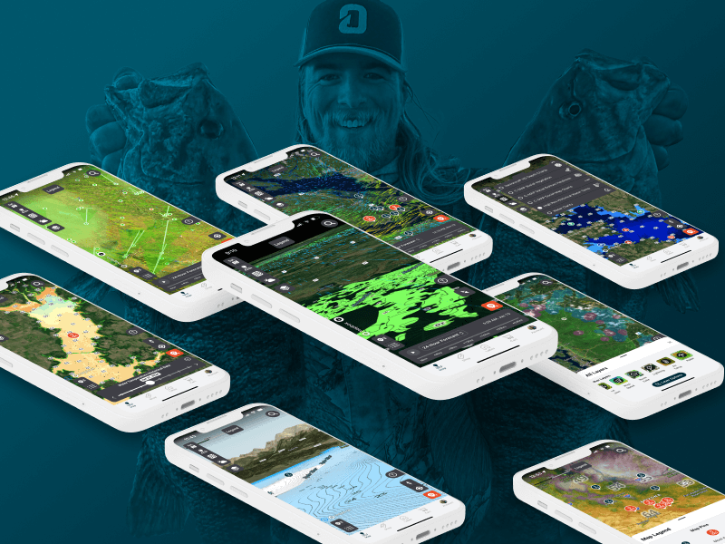
Omnia PRO Advanced Mapping ToolsUX / UI Design
Global Search on Dwolla.comUX / UI Design
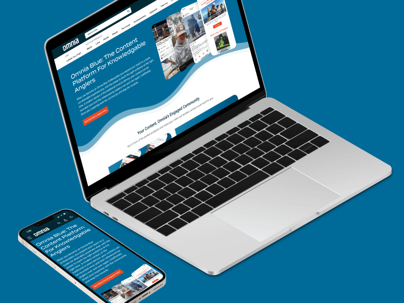
Omnia Blue Landing PageWeb Design
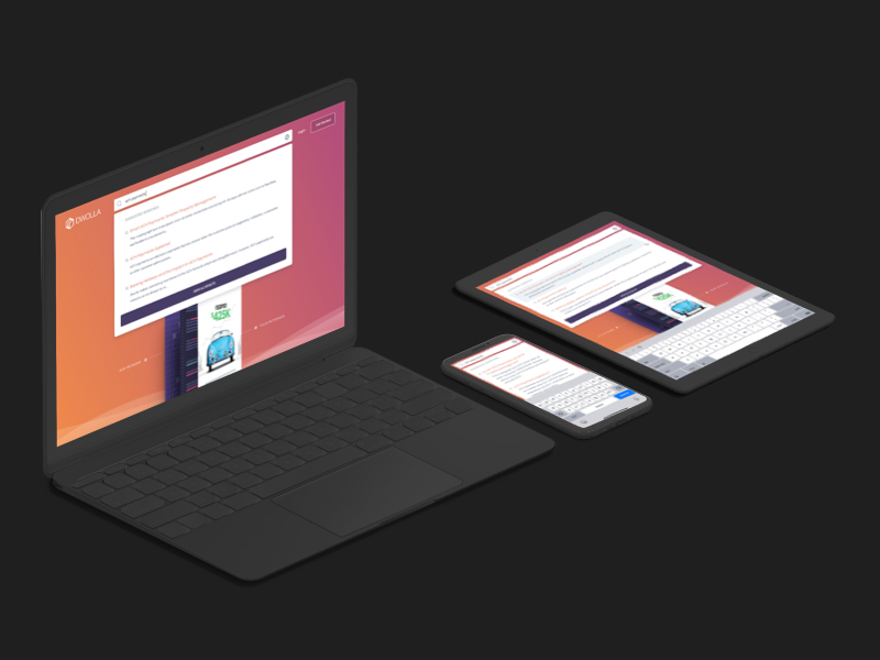
Dwolla Marketing Site RedesignWeb Design
Dwolla Identity Design SystemBranding
Montoya Lawn & Outdoor ServicesBranding
FinTech Product PrototypeUX / UI Design

Dwolla Core ValuesBranding
Landing Page GraphicIllustration
Red Benny Font SpecimenBranding / Typography

Office City Location IllustrationsIllustration

Louis C.K.Illustration
Flat Finance IconsIllustration
Democrat Republican LogoIllustration
Isometric IllustrationsIllustration
Flat Audience IconsIllustration
Dwolla Mission, Visions & ValuesTypography / Print
Food Benefit PosterPrint